
Style in Translation
How we transformed personal aesthetic into brand identity for Olivia Palermo
-
Create a visual identity for style authority Olivia Palermo that would translate her impeccable taste into a cohesive brand world—one that could evolve from lifestyle to beauty while maintaining its distinctive DNA.
-
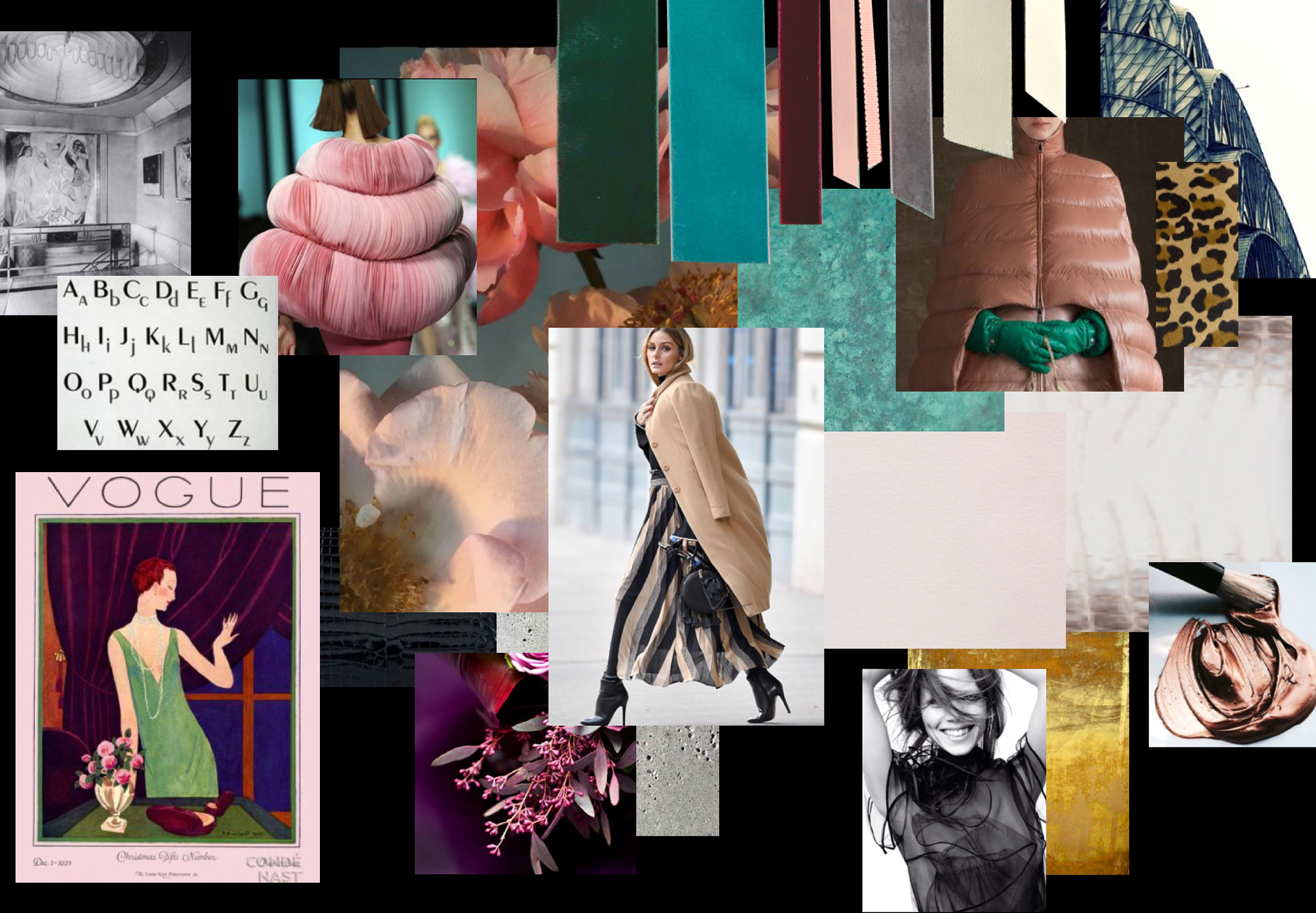
True style isn't just about looks—it's about texture, touch, and tangible quality. By approaching brand development like a fashion collection, we could create something that felt authentically Olivia.
-
Rather than starting with digital mood boards, we began with: Physical brand boards • Fabric swatches • Ribbon samples • Jewellery pieces • Metal finishes • Paper textures
Drawing from Olivia's world:
Art Deco New York architecture • Symmetry and repetition • Clean, considered lines • Fresh colour perspectives • Hometown glamour • Modern luxury codes -
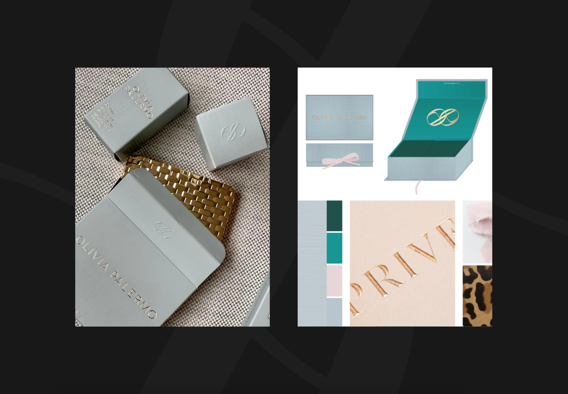
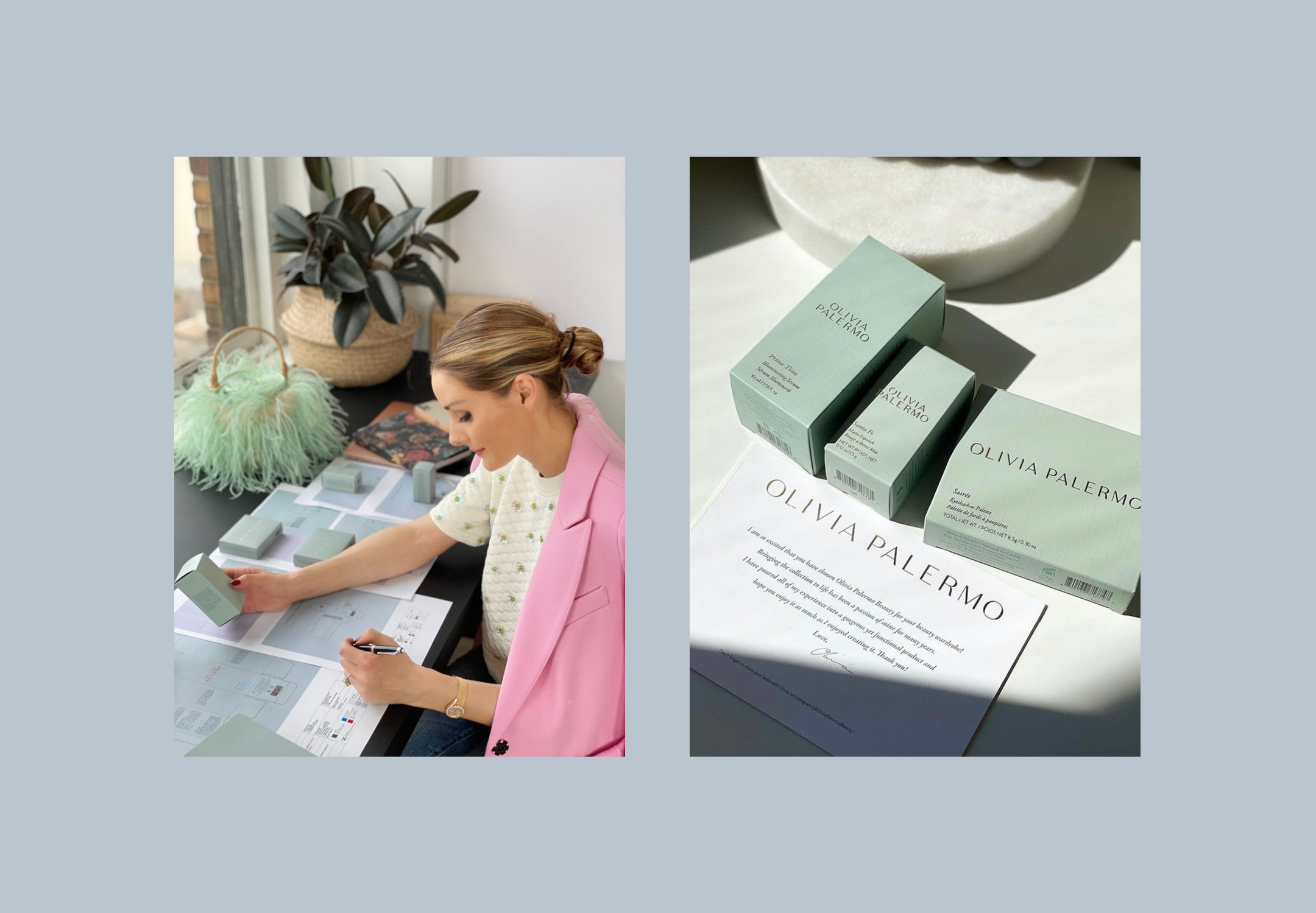
We created: Complete brand identity system • Physical-to-digital translation • Corporate collateral suite • Packaging design framework • Brand guidelines • Future-proof design system
THE EVOLUTION
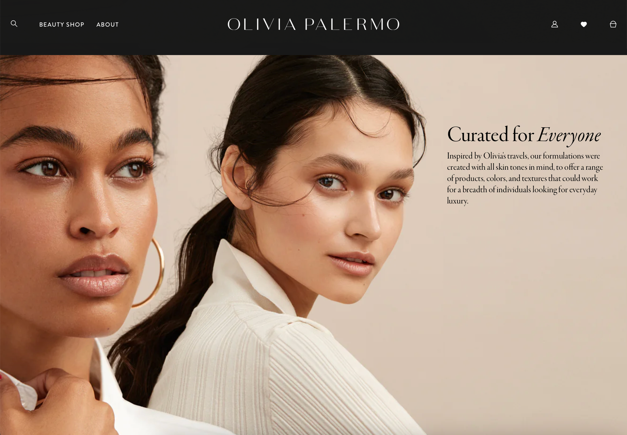
The identity successfully: Launched lifestyle brand (2020) • Expanded into beauty • Informed product design • Guided packaging development • Created retail presence • Established brand world


The Elements
Visual Language
• Symmetrical compositions
• Art Deco influences
• Modern colour theory
• Texture relationships
• Pattern development
Brand Architecture
• Logo system
• Typography suite
• Colour strategy
• Pattern library
• Material guide
Application
• Corporate identity
• Product packaging
• Digital presence
• Retail experience
• Beauty line extension

WHY IT WORKED
Success came from understanding: Style transcends category • Physical informs digital • Details define luxury • Heritage inspires future • Personal becomes universal
